MY FAVORITE COVERS: JIM LEE
The ‘All Star Batman’ artist calls out 8 unforgettable images
By Jake Rossen | Posted October 7, 2007 9:00 AM |
“I was just a kid when I saw that image. It’s basically the Flash on his knees, holding the Golden Age Flash and crying under the sky. I think it really demonstrated the prowess of Adams’ work because there was such realism, but at the same time such energy and such emotion that he was pulling through the figures. Not just through their faces, but their body language. Even as a young artist I was going, ‘Man, I wish I could draw something like that.’”
“The X-Men were my favorite comic characters growing up. I bought this when we were driving around on a summer vacation with my family. I had been an old X-Men fan as a kid, and then I saw this and I was like, ‘What the hell is this?’ That’s just a great comic cover. You have the old X-Men facing off against the New X-Men. It’s a great composition with Professor X in the middle, his arms up against a white background.”
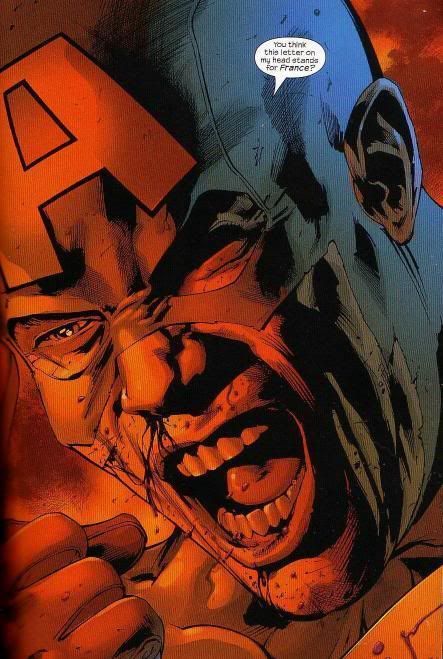
“I have to go with a Todd McFarlane cover. Todd’s work has always had this kind of gnarly, twisted element to it. As a piece of comic book pop art, it’s like Kirby to me. I just look at that cover and go, ‘Wow, that’s a cool Captain America.’ I love how he captured that character and posed it differently than how he had Spider-Man up on the wall. “
“That’s one of my favorite covers of all time. The way Frank Miller drew Batman, I’d never really seen him that blocky and square. He filled up the proportions of a comic book cover perfectly. He just looks beat up, like he’s been through hell. He still looks like he could kick your ass.”
“The usual approach to superheroes is to make them look larger than life, put the camera underneath them. But Kevin Maguire did this down-shot, making them look more human. And not just the angle, but also through the facial gestures and the subtleties in body language.”
“Classic Jack Kirby. Two characters look like they’re fighting, but they’re not. He was able to do that unlike any other comic book artist. These characters are very posed, but at the same time they look like they’re in motion. It’s a very, very hard thing to do. He just made it work.”
“Frank used a DuoBoard [special paper that creates gradients when you apply chemicals]. No one really uses it anymore, because you can replicate it in Photoshop. It’s just a very simple cover that really captured the three main protagonists of that issue.”
“At the time, I didn’t know how they did it. But they took the artwork with Havok, who has a black costume, and did a color hold in orange. He really played up Havok’s costume and used to it to create a very modern-looking cover.”
Superstar artist and WildStorm head honcho Jim Lee’s credits include acclaimed runs on X-Men and Batman and creating WildC.A.T.S. Currently he’s penciling Frank Miller’s All Star Batman and Robin, the Boy Wonder.


No comments:
Post a Comment